top of page
I am a creative illustrator & brand designer
TipTong
Client: Maarten Lermytte & Fredrik De Beul
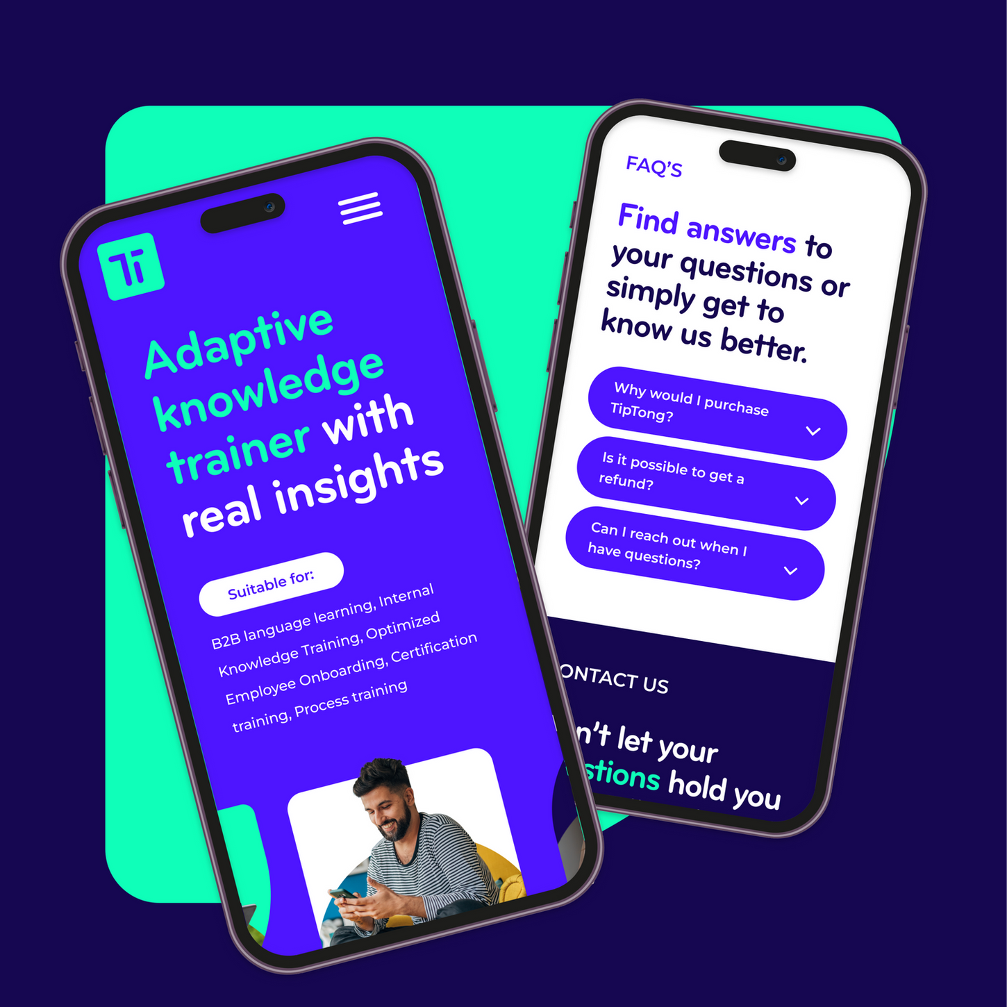
TipTong is all about making learning fun again. It helps people grow their language skills right inside their company’s tools, without making it feel like work. No pressure, no heavy lessons, just small bits of learning that fit into the day. It’s made to feel natural, like chatting with a friend and picking up new words along the way.
The branding has that same friendly energy. It’s colorful, soft, and curious. Rounded shapes, light motion, and a tone that feels human. Everything about TipTong is made to keep people moving, smiling, and learning at their own pace. Because when it feels good, you keep coming back.


bottom of page


